Creating Graphs
Create graphs to visualize your data. This page explains basic graph types including histograms, scatter plots, bar charts, and time series plots.
How to Create Graphs
- Open Graph Builder tab: Click the "+" button at the top of the screen and select "Graph Builder"
- Select dataset: Choose the dataset to graph from the dropdown menu in the header
- Select graph type: Click the type of graph you want to display (Histogram, Scatter Plot, Bar Chart, etc.)
- Configure settings: Set axes and variables according to the selected graph type
- Histogram: Variable, number of bins, grouping
- Scatter plot: X-axis, Y-axis, color coding, size
- Bar chart: Category, value, aggregation method, sorting
- Adjust options: Set filter conditions and additional options as needed
Graphs are displayed in real-time in the preview area on the right, allowing you to explore optimal visualizations while changing settings.
Basic Graphs
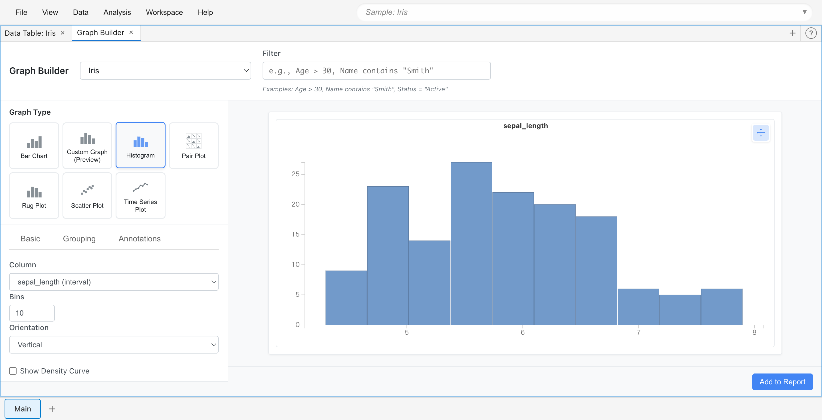
Histogram
Displays the distribution of a single numeric variable as a bar graph. Useful for understanding frequency distribution and shape of data, and identifying outliers.
Use cases:
- Check age distribution
- Examine test score distribution
- Understand sales amount distribution
Settings:
- Variable: Select the numeric column to graph
- Bins: Specify the number of bars (bins)
- Group By: Select a category column to display color-coded by group
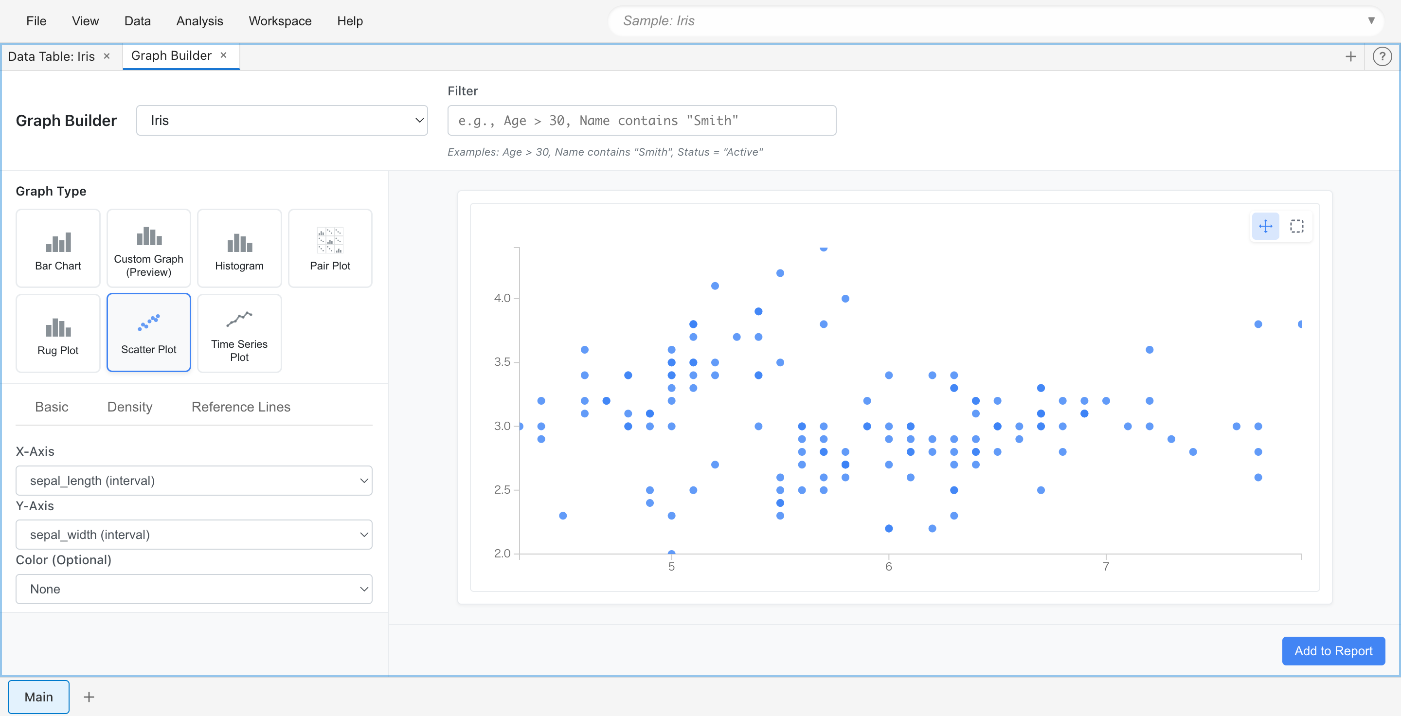
Scatter Plot
Visualizes the relationship between two numeric variables as points. Discover correlations, patterns, clusters, and outliers. Supports interactive selection, density visualization, and grouping by categorical variables.
Use cases:
- Examine relationship between height and weight
- Check correlation between advertising spend and sales
- View relationship between scores in two exam subjects
Settings:
- X Axis: Numeric column for horizontal axis
- Y Axis: Numeric column for vertical axis
- Color By: Select a category column for color-coded grouping
- Size By: Select a numeric column to represent with point size
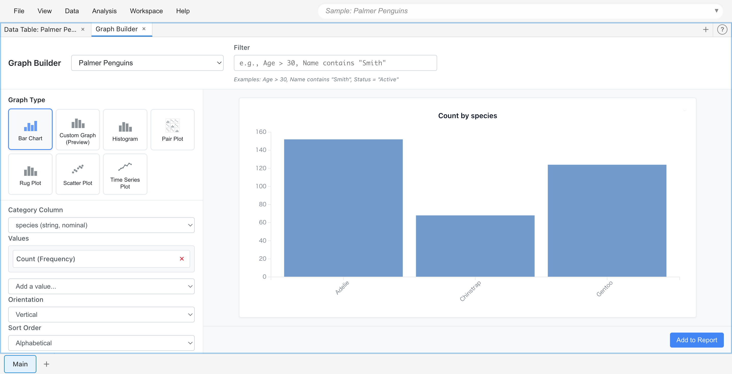
Bar Chart
Compares values by category using vertical or horizontal bars. Ideal for comparing categorical data, ranking displays, and showing aggregate statistics (count, sum, average, etc.).
Use cases:
- Compare sales by product category
- Display customer count by region
- Aggregate order count by month
Settings:
- Category: Column representing categories
- Value: Numeric column to aggregate
- Aggregation: Aggregation method (Count, Sum, Average, etc.)
- Orientation: Vertical or horizontal bars
- Sort: Sort order
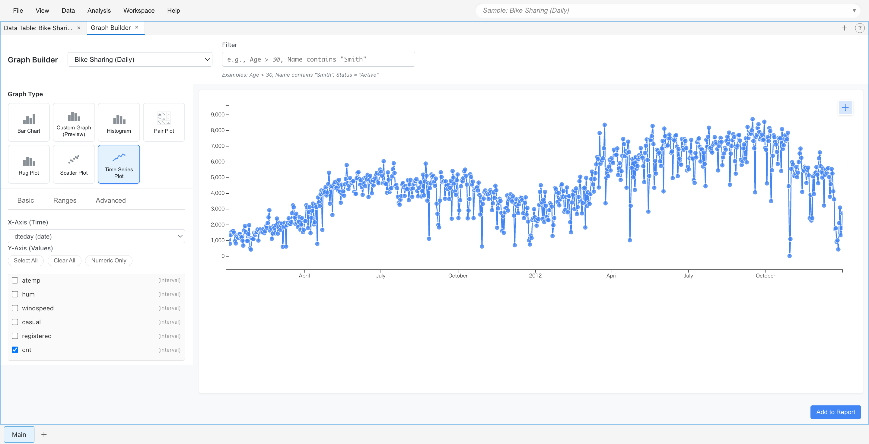
Time Series Plot
Displays data changes over time as a line chart. Identify trends, seasonality, and patterns. Display multiple time series with different line styles and compare across periods.
Use cases:
- Check daily sales trends
- Track monthly visitor changes
- Observe annual temperature variations
Settings:
- Time: Column representing date or datetime
- Value: Numeric column to display
- Group By: Used when displaying multiple series
Advanced Graphs
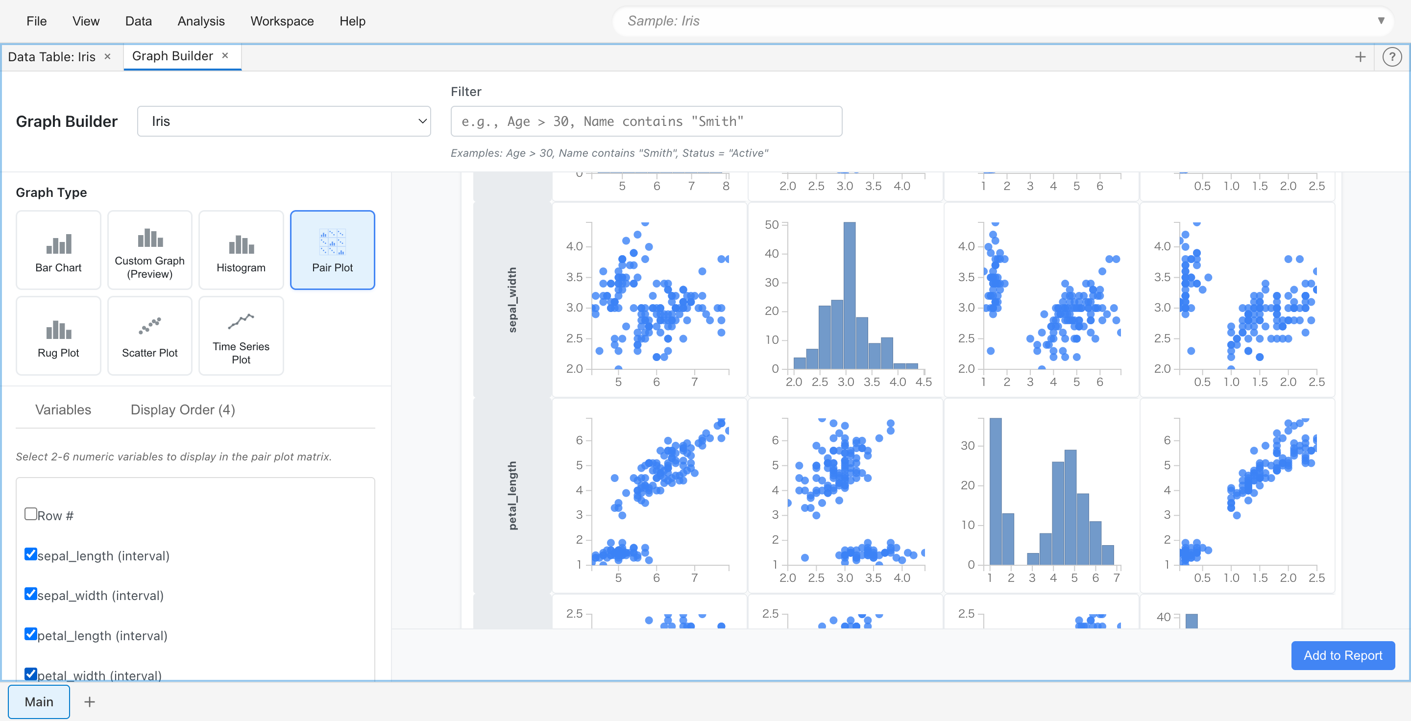
Pair Plot
Displays pairwise relationships between multiple numeric variables as a scatter plot matrix. The diagonal shows the distribution of each variable. Useful for exploring correlations and multivariate patterns.
Use cases:
- Check correlations between multiple measurements at once
- Understand the overall structure of a dataset
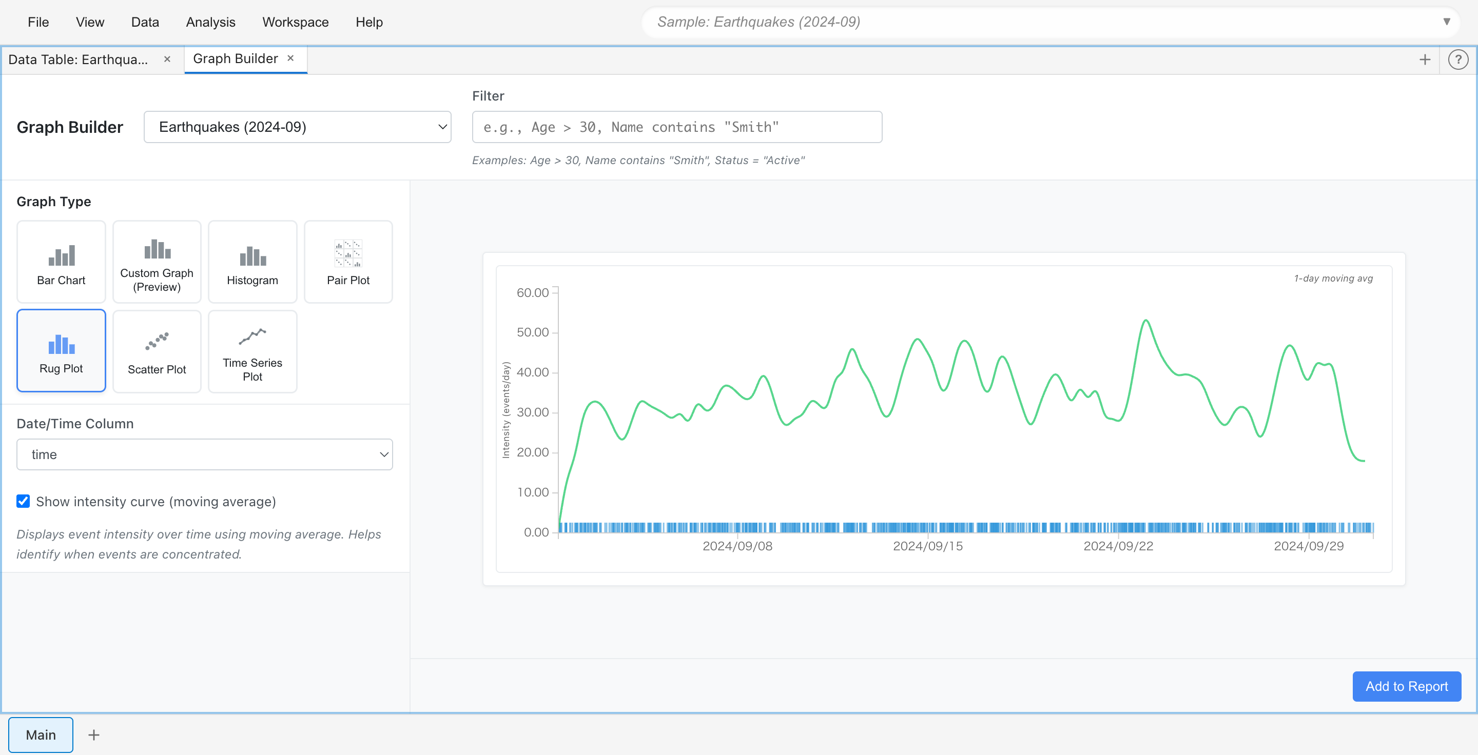
Rug Plot
Visualizes the temporal distribution of datetime events. Displays individual events as vertical lines (ticks) on a timeline, with optional intensity curve using moving average.
Use cases:
- Check timing of log events
- Visualize concentration of access times
Custom Graph
Creates flexible visualizations based on Grammar of Graphics principles. Build layered plots by combining geometric elements, statistical transformations, and aesthetic mappings.
See the Custom Graph Guide for details.
Graph Operations
Interactive Selection
All graphs support data point selection. Selection methods vary by graph type:
Rectangle Selection (Scatter Plot, Histogram, Rug Plot)
- Selection mode: Drag mouse to select a range
- Pan mode: Drag graph to move the display range
Mode toggle buttons are displayed below the graph.
Click Selection (Bar Chart, Time Series Plot, Pair Plot, Custom Graph)
- Click bars, points, or bins to select
- Cmd/Ctrl+click to add to selection or deselect
Selected rows are highlighted in other tabs and graphs as well.
Saving Graphs
Graph settings created in Graph Builder are automatically saved to the project as tab state. Graph settings are preserved when you close and reopen the project.
To save a graph as an image:
- Add the graph to a Report ("Add to Report" button)
- Click the "Export" button for the graph in the Report tab
- Save in SVG format
Changing Settings
Graph settings (column selection, filters, display options, etc.) can be changed at any time. Graphs update in real-time when settings are changed.