Advanced Graph Creation
Graph Builder provides multiple Graph Types such as Bar Chart, Histogram, and Scatter Plot. When you have a well-defined graph format in mind and only need minor adjustments, these are convenient and easy to use.
However, as you perform more in-depth analysis, you may want more flexible control over visualizations to create custom graphs. Custom Graph provides this capability.
Custom Graph is based on the Grammar of Graphics theory. By decomposing graphs into components like "data," "statistical transformations," "geometric objects," and "coordinate systems," and freely combining these as layers, you can achieve advanced visualizations such as:
- Overlaying multiple graph types in one graph (e.g., scatter plot + regression line + confidence interval)
- Visualizing data after statistical transformation (e.g., histogram, kernel density estimation)
- Exploring multidimensional data with facets (small multiples)
- Flexibly controlling axis scales and directions
If other Graph Types are like "ready-made furniture," Custom Graph is like an "assembly kit of materials." Once you understand the basic components, you can create virtually unlimited visualization patterns depending on how you use them.
The 7 Components of Grammar of Graphics
Custom Graph builds graphs by combining these 7 elements:
- Data: The dataset to visualize
- Aesthetics: The mapping between variables (dataset columns) and visual attributes (position, color, size, etc.)
- Layers: Individual visual elements when overlaying multiple elements
- Statistics: Statistical transformations of data (binning, smoothing, etc.)
- Scales: How to convert data values to visual values
- Coordinates: Coordinate system (Cartesian coordinates, axis swapping, etc.)
- Facets: The structure when creating graphs composed of multiple small graphs
By combining these, you can visualize diverse aspects of your data.
Data - Selecting Data
First, select the dataset to visualize. Here we use the Auto MPG dataset (fuel efficiency data for 398 cars from 1970-1982).
Aesthetics - Mapping Visual Elements
Map data columns to visual attributes. The most basic is mapping two continuous variables to the x and y axes.
Data: Auto MPG
Aesthetics: x = weight, y = mpg
Geometry: Point
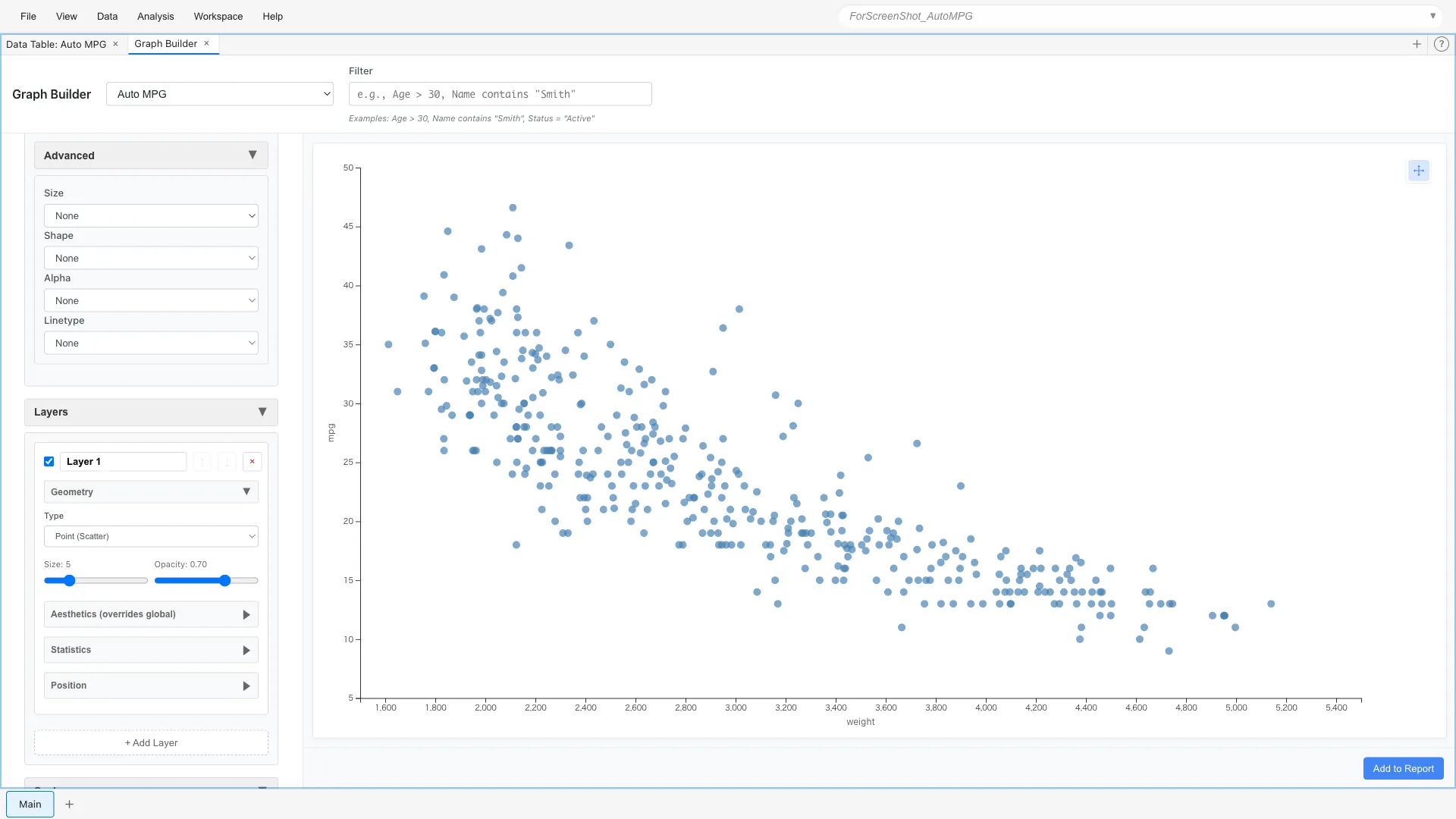
A clear negative correlation is visible: heavier cars have worse fuel efficiency.
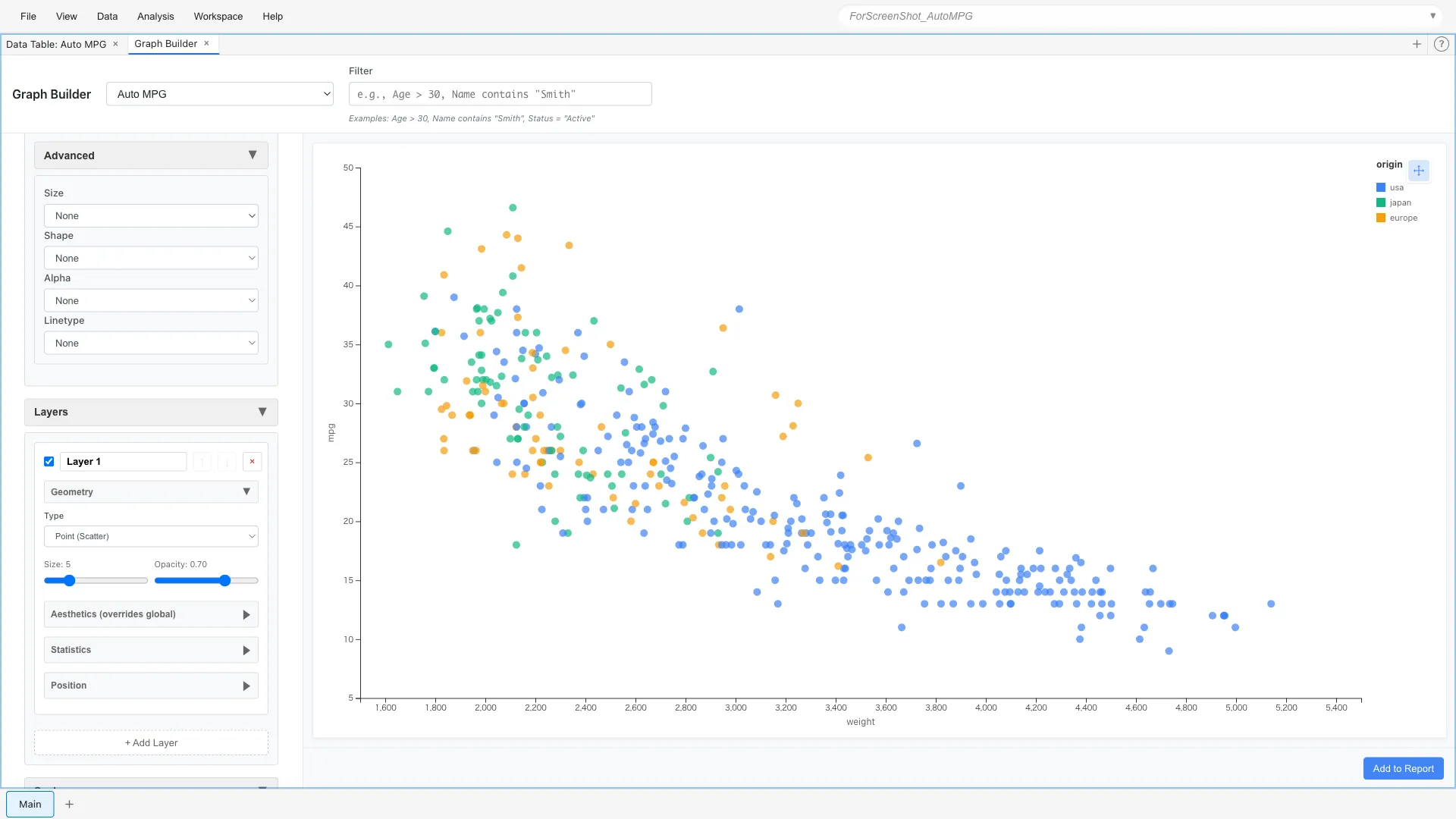
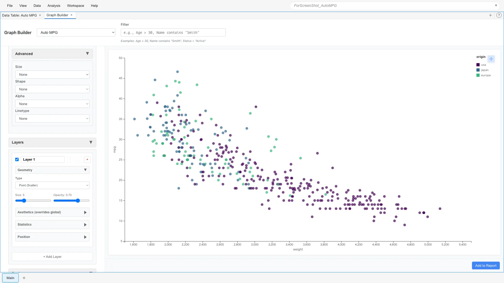
Mapping to Color
You can add more information by mapping a third variable to color.
For example, let's color-code by origin (USA, Europe, Japan).
Aesthetics: x = weight, y = mpg, color = origin
Mapping to Size
Map horsepower to point size.
Aesthetics: x = weight, y = mpg, color = origin, size = horsepower
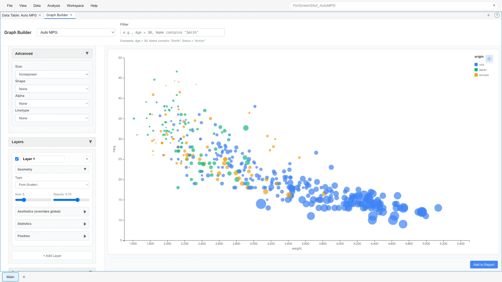
Larger points indicate higher horsepower. You can visually understand the relationship: heavy, high-horsepower cars have poor fuel efficiency.
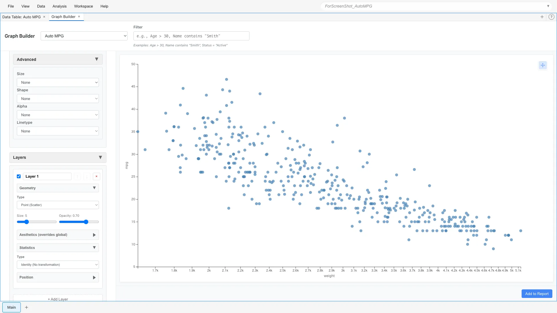
Layers - Overlaying Layers
Layers allow you to overlay multiple graphs. For example, let's add a LOESS smoothing curve on top of a scatter plot.
Layer 1: Point (x = weight, y = mpg)
Layer 2: Line + Smooth statistic (method = lm)
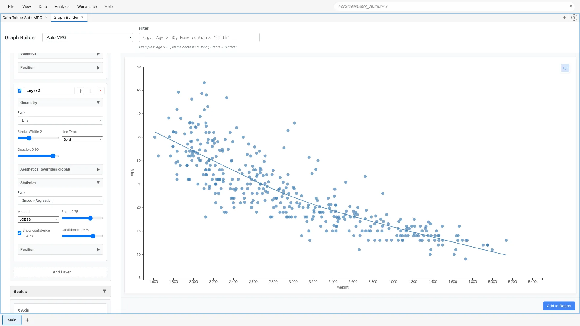
The blue line is the smoothing curve. It shows the average trend as a curve.
Statistics - Statistical Transformations
You can display data not just as-is, but after statistical transformation.
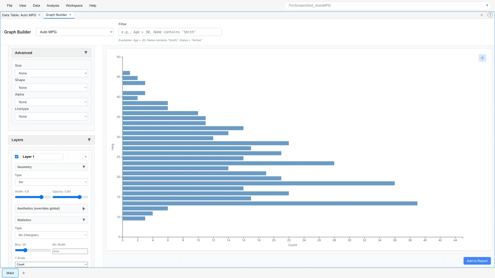
Histogram (Binning)
To see the distribution of fuel efficiency, we divide the data into bins (intervals) and count them.
Aesthetics: x = mpg
Geometry: Bar
Statistics: Bin (bins = 20)
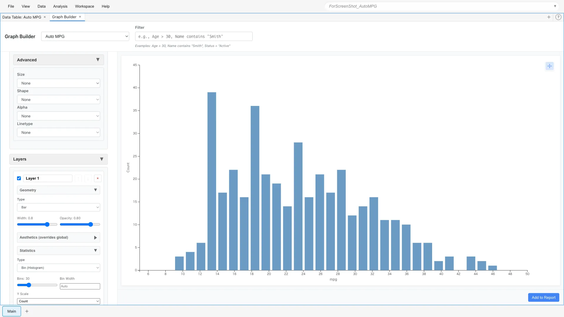
You can see that most cars are concentrated in the 15-30 mpg range. The distribution is slightly skewed to the right, with fuel-efficient cars being a minority.
Density Estimation
Instead of bins, you can express the distribution as a smooth density curve.
Aesthetics: x = mpg
Show Density Curve: Yes
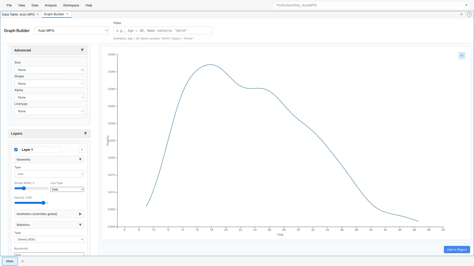
This expresses the same information as the histogram with a continuous curve.
Comparing Densities Across Multiple Groups
By overlaying density curves for each category, you can compare distribution differences.
Let's draw density curves on top of histograms for each origin.
Layer 1 (Bar):
  Aesthetics: x = mpg, fill = origin
  Geometry: Bar
  Statistics: Bin (bins = 30)

Layer 2 (Line):
  Aesthetics: x = mpg, color = origin
  Geometry: Line
  Statistics: Density (Y Scale = Count)
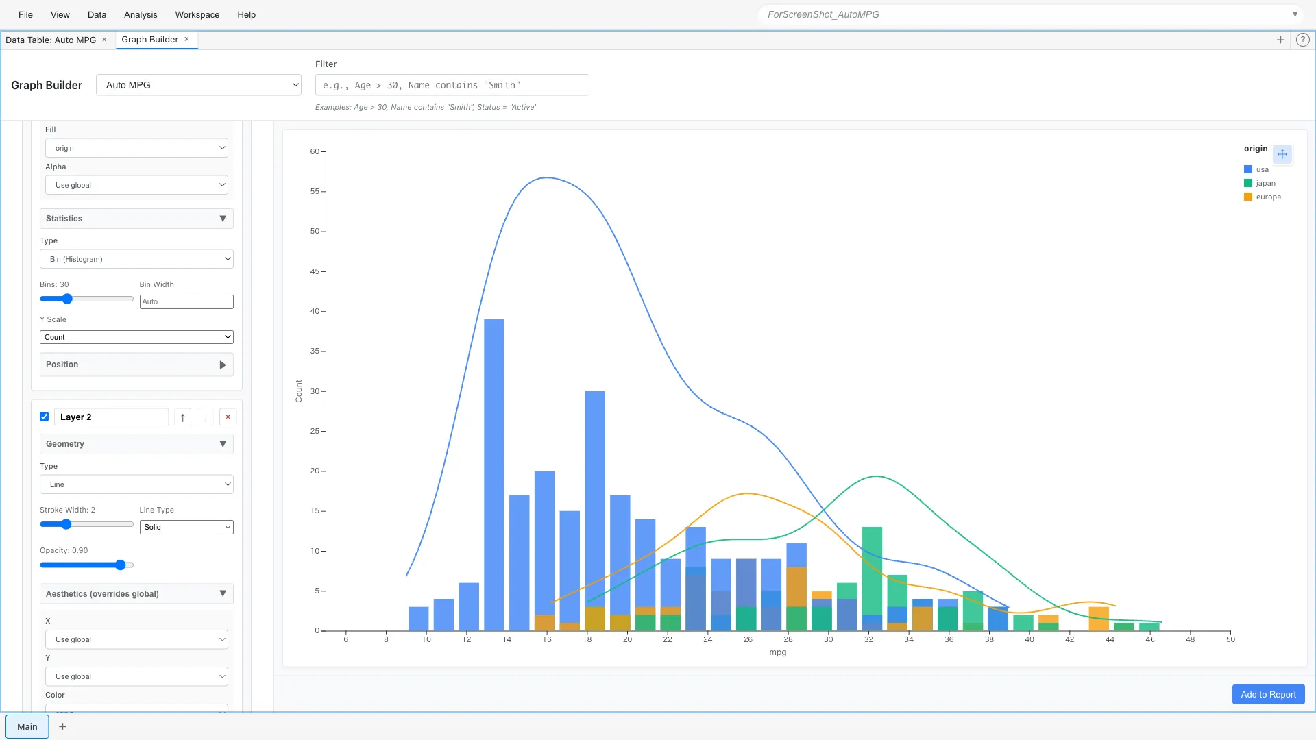
Key points:
- Layer 1 (Bar):
fill = originfor color-coded bar graph - Layer 2 (Line):
color = originfor color-coded density curves,Y Scale = Countto match scale with histogram - Since Bar and Line use the same color scale, colors match
It's clear that Japanese cars peak on the high fuel efficiency side, while US cars peak on the low fuel efficiency side.
Position - Position Adjustment
Position adjustment becomes important when comparing multiple categories in bar charts.
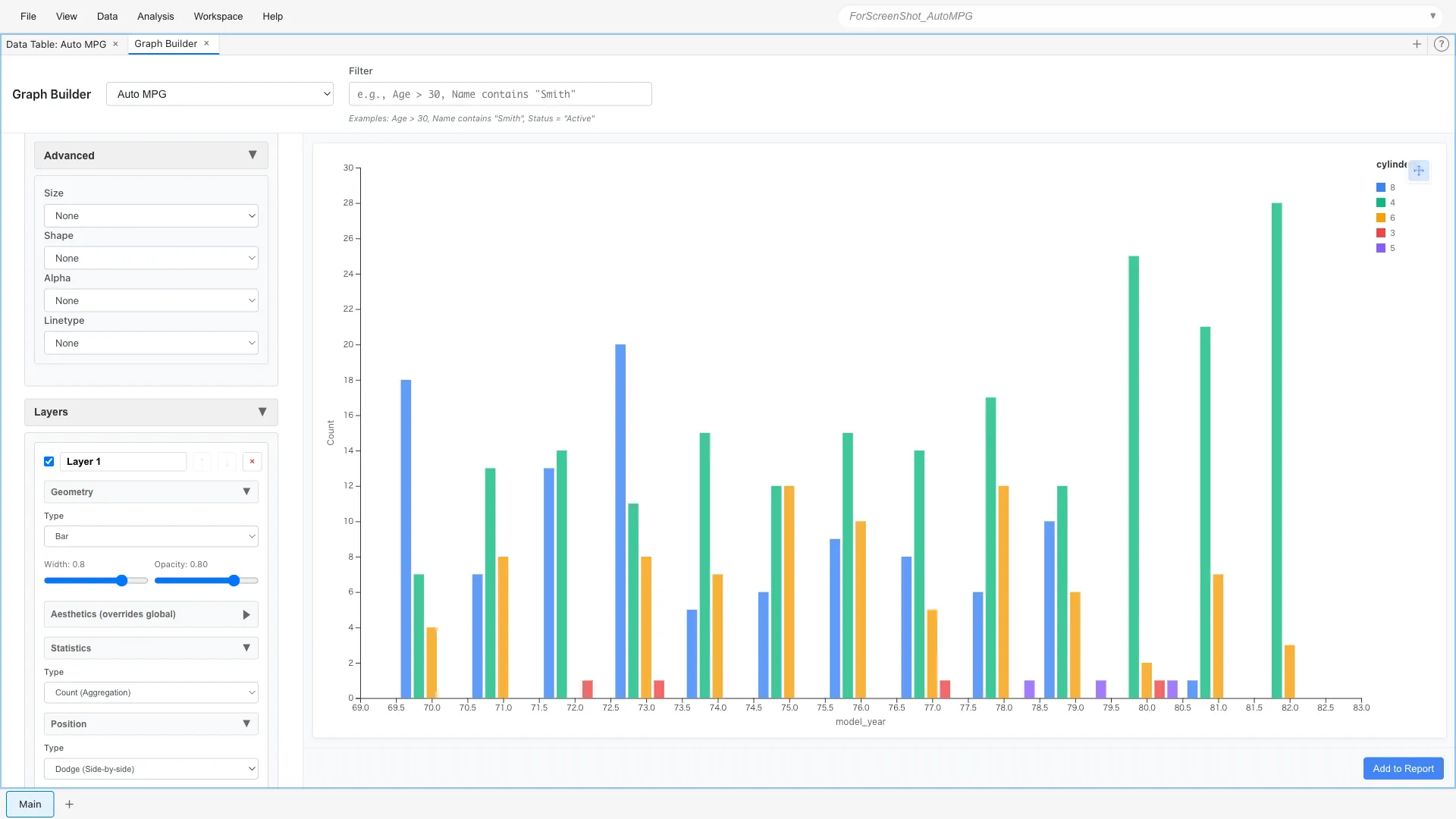
Stacked Bar Chart
Aesthetics: x = model_year, fill = cylinders
Geometry: Bar
Statistics: Count
Position: Stack
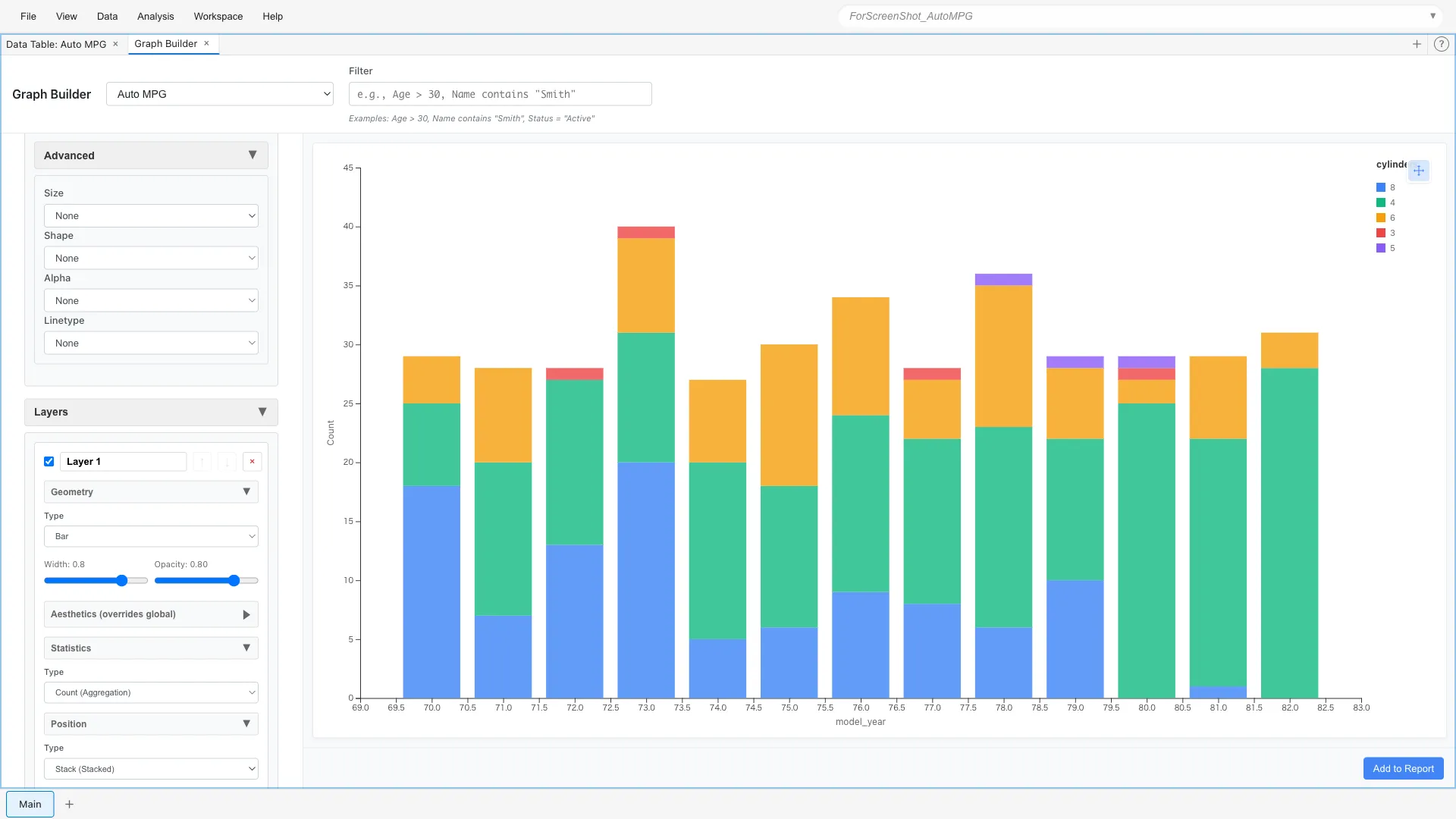
The breakdown of car types for each year is shown as stacked bars. 8-cylinder cars were common in the early 1970s, with 4-cylinder cars increasing toward the end.
Grouped Bar Chart
Changing Position to dodge displays them side by side.
Position: Dodge
This makes it easier to compare trends for each cylinder count.
Coordinates - Coordinate System
Flipping Axes
Flipping histograms and bar charts horizontally makes long labels easier to read.
Aesthetics: x = mpg
Geometry: Bar
Statistics: Bin
Coordinates: Flip
The vertical and horizontal axes are swapped, displaying the histogram horizontally. Useful when category names are long or when you want to effectively use vertical space.
Facets - Facet Division
Splitting and arranging graphs by category makes subgroup comparison easier. The Facets section has two types: Facet Wrap (division by single variable) and Facet Grid (matrix division by two variables).
Facet Wrap - Division by Single Variable
Facet Wrap divides data by one categorical variable and arranges multiple panels in a grid.
*Note: The variable's scale must be Nominal or Ordinal to be specified as division criterion. Here we've changed the cylinders variable to Ordinal Scale.
Aesthetics: x = weight, y = mpg
Geometry: Point
Facets: Type = Facet Wrap (Single Variable)
  Variable = cylinders
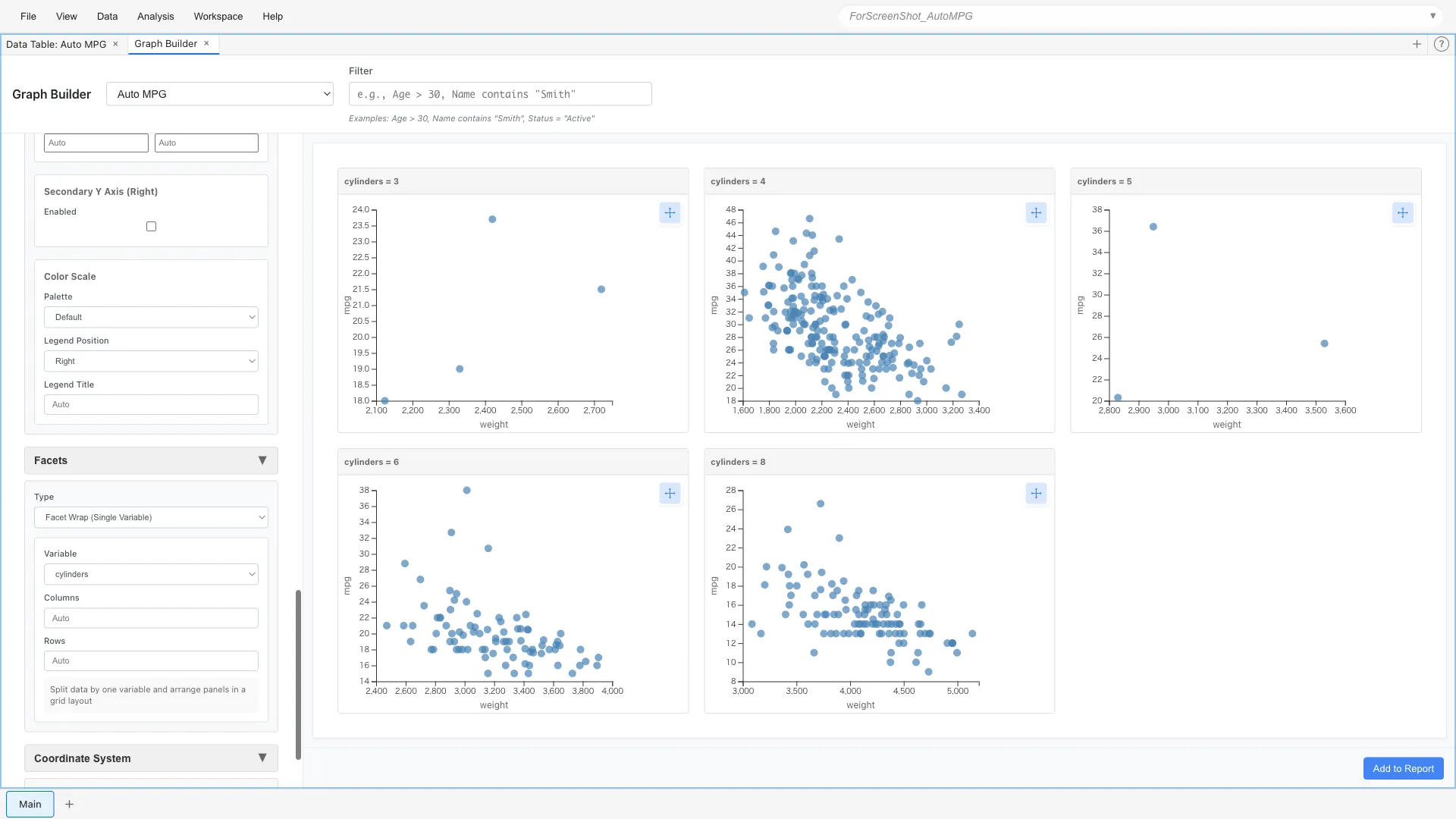
You can compare the weight-fuel efficiency relationship side by side for 4-cylinder, 6-cylinder, and 8-cylinder cars. 8-cylinder cars are generally heavier and concentrated in the poor fuel efficiency range.
As another example, you can also divide by origin:
Aesthetics: x = weight, y = mpg
Geometry: Point
Facets: Type = Facet Wrap (Single Variable)
  Variable = origin
Panels are arranged horizontally for each origin (europe, japan, usa).
Facet Wrap has options to control panel arrangement:
- Variable: Categorical variable to use for division
- Columns: Number of panels per row (optional)
- Rows: Number of columns (optional)
If only Columns is specified, row count is calculated automatically. If only Rows is specified, column count is calculated automatically. If both are omitted, optimal arrangement is calculated based on panel count.
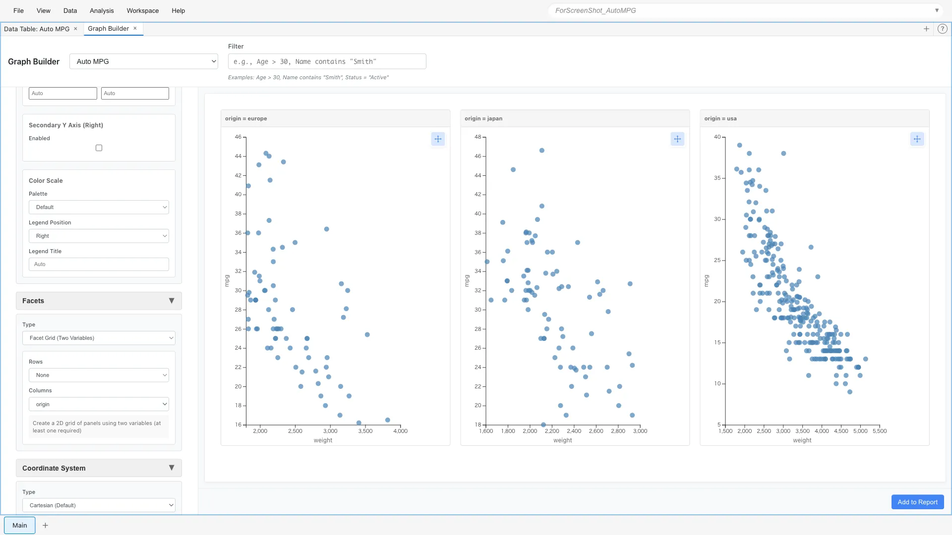
Facet Grid - Matrix Division by Two Variables
Facet Grid uses two categorical variables to define rows and columns, enabling more complex comparisons.
Facets: Type = Facet Grid (Two Variables)
  Rows = cylinders
  Columns = origin
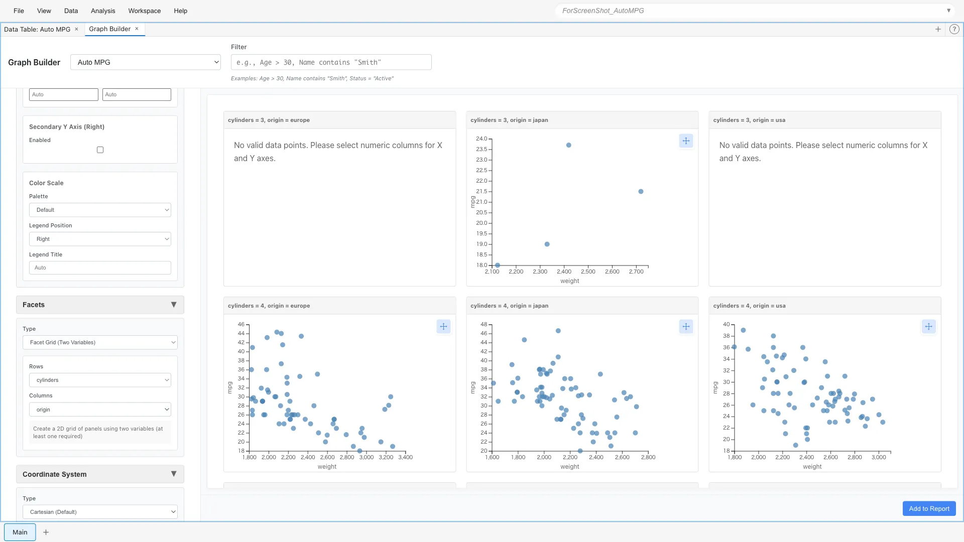
Graphs are arranged for each combination of cylinder count and origin.
Scales - Scale Control
Logarithmic Scale
When data range is wide, logarithmic scale is effective.
Scales: x = log
Color Scale
You can specify which colors to use with color scales.
Different palettes are available for continuous and categorical variables.
Aesthetics: x = weight, y = mpg, color = origin
Scales: Palette = Viridis (Discrete)
Viridis (Discrete) is a palette that is perceptually uniform and accommodates color vision diversity. Optimized for categorical data, it's distinguishable even when printed or displayed in grayscale. Discrete versions of Plasma, Inferno, and Magma are also available.
Summary
Custom Graph can achieve complex visualizations by freely combining 7 elements. While there are many configuration options and it can be complex, it can accommodate a wide range of requirements.